CovidTracker: Who is the 24-year-old behind France's most viewed Covid graphs?
For nearly a year, the French public has been counting on a 24-year-old data-wiz to explain the latest Covid-19 developments. We sat down to chat with Guillaume Rozier, to ask why he spends his spare time creating Covid-charts for free.
When Guillaume Rozier in October got a phone call from a hospital director in the south of France who wanted to thank him for his daily updates on the Covid-19 situation in France, it gave him pause.
"My first reaction was that I was very proud to have created something that is useful to people," Rozier told The Local.
"My second reaction was: am I legitimate? Is it normal that hospitals lean on the work of a student?"
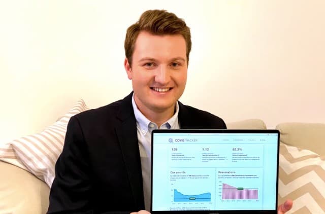
Rozier is better known as CovidTracker, the website on which he analyses the development of Covid-19 in France through colourful, self-made maps and graphs.
He shares his findings on his Twitter account, GRZ-CovidTracker, alongside bite-sized analysis, so that everyone - not just those with a particular eye for number crunching - can keep à jour with the epidemic.
With more than 30,400 followers, Rozier has become something of a celebrity in France since the pandemic hit last spring.
But it was never his intention to become Monsieur CovidTracker, it just sort of happened.
It started in March, 2020, before France really knew what Covid-19 was and what disastrous impact the novel coronavirus would have on its health system, economy and collective mental health.
"There was little talk of Covid in France at the time. But the situation in Italy was very tense. I wanted to see if we were headed in the same direction," Rozier said.
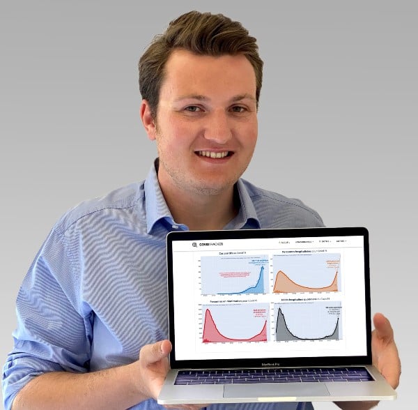
Photo: Private
Back then Rozier was completing a graduate degree in computer science in Nancy, northeast France. He had specialised in big data, and mastered the practice of gathering large datasets to reveal patterns and trends. So he collected open data on France and Italy from the Johns Hopkins University in the United States and transferred them into what would become his first of many Covid charts.
"What surprised me was that we had exactly the same explosivity, the same rise in cases," he said.
France mirrored Italy, by a delay of just eight-nine days. That meant Italy's sufferings from Covid-19 would soon be felt in France.
In retrospect this seems obvious, but at the time no one knew how the first wave of Covid-19 infections would unfold.
Rozier shared the graphs with family, friends and published them on Twitter.
As the virus gained in strength, spreading across the country at an increasingly rapid pace, people wanted more graphs.
Eventually, the website CovidTracker was born.
Since the spring, the French public health agency Santé Publique France has published detailed breakdowns of case numbers and hospitalisation rates broken down by area, but the data is dense and not always presented in a user-friendly fashion.
"I never intended for this to become so big," said Rozier. "Initially, I'd say to myself, 'next week I'll close down the site'. I really didn't think I was the best person to do this, I thought someone else, more competent than me, would come along and do something better."
But no one did and the project continued to grow. Rozier's Twitter followers increased tenfold, until, that day in October, a hospital director called to thank Rozier for his work.
"Now that I know that hospitals are leaning on the information I provide, there's a lot more pressure. If there is an error or a bug on the site, I know that it needs to be fixed straight away," he said.
"But it's very important that it remains an amateur website. It's important to keep that in mind when consulting the site."
À l’hôpital, il semblerait qu’on soit toujours dans la seconde vague… pic.twitter.com/93VJQtqdIZ
— GRZ - CovidTracker (@GuillaumeRozier) January 21, 2021
Rozier now works full time as a data science consultant and runs CovidTracker on his spare time - weekends and evenings - together with five other volunteers who joined the project later.
The website CovidTracker is open to everyone and free from ads, although Rozier recently opened up for people to give donations if they want.
When 78-year-old Mauricette became the first person to receive the Covid-19 vaccine in France on December 27th, CovidTracker got a sister tool, VaccineTracker, which tracks the progress of France's vaccine programme.
? Voici un tout nouvel outil, VaccinTracker ! Suivez l’évolution de la vaccination contre la #Covid19 en France. Nombre de personnes vaccinées, types de vaccins autorisés, phases de vaccination… ?? https://t.co/kvTxPYHCFp @CovidTracker_fr pic.twitter.com/dBNrfDyxVa
— GRZ - CovidTracker (@GuillaumeRozier) December 27, 2020
But before long one big problem arose: "There was no data available," Rozier said.
To find out how many people were vaccinated each day during the first couple of weeks of the programme he ransacked local newspapers, searching for updates on which nursing homes had injected their first doses. It was a tedious, slow process, and there was no way he would manage to compile an exhaustive dataset.
Then, one day, the health minister's office contacted him directly to ask if he wanted the full data sent to his inbox. He said yes.
"But by the end of the week, I thought 'this is wrong'," he said.
The whole idea behind VaccinTracker was to build trust through transparency, providing everyone - not just Rozier - with full insight into France's vaccination programme, a crucial service in a country that has a historically high level of vaccine scepticism.
ANALYSIS: How worried does France need to be about its vaccine-sceptics?
He told the health ministry he would not update VaccinTracker until they opened up the data for everyone to access. That same night, the ministry sent out a press statement saying they would make the data open to the public. It is now updated daily on the TousAntiCovid track and trace app.
"There's still a lot of data lacking," he said.
Currently France - in common with most other European countries - publishes the total daily number of injections given without breaking them down by age, geography, or how many of the people have received a second dose - crucial information that Rozier hopes will soon become available.
While he still had no answer to the question he had asked himself back in autumn - is he the right person to be doing this - part of the response could maybe be found in what he called "the natural functioning of open data".
The reasoning, offered by one of Rozier's readers, goes like this: the state executes a task that it alone can do - collecting sensitive health data, anonymising it and publishing it in an exhaustive, daily manner.
"Then, it's up to citizens to take that data and use it in a creative, innovative way that it them into something that has a real utility," he said.
In a way, he explained, citizens went over the state's work to highlight important information with colourful markers.
Whether it was the best solution, he did not know.
"But it shows that transparency and open data is crucial to spur confidence in public institutions."
Comments (1)
See Also
When Guillaume Rozier in October got a phone call from a hospital director in the south of France who wanted to thank him for his daily updates on the Covid-19 situation in France, it gave him pause.
"My first reaction was that I was very proud to have created something that is useful to people," Rozier told The Local.
"My second reaction was: am I legitimate? Is it normal that hospitals lean on the work of a student?"
Rozier is better known as CovidTracker, the website on which he analyses the development of Covid-19 in France through colourful, self-made maps and graphs.
He shares his findings on his Twitter account, GRZ-CovidTracker, alongside bite-sized analysis, so that everyone - not just those with a particular eye for number crunching - can keep à jour with the epidemic.
With more than 30,400 followers, Rozier has become something of a celebrity in France since the pandemic hit last spring.
But it was never his intention to become Monsieur CovidTracker, it just sort of happened.
It started in March, 2020, before France really knew what Covid-19 was and what disastrous impact the novel coronavirus would have on its health system, economy and collective mental health.
"There was little talk of Covid in France at the time. But the situation in Italy was very tense. I wanted to see if we were headed in the same direction," Rozier said.
Photo: Private
Back then Rozier was completing a graduate degree in computer science in Nancy, northeast France. He had specialised in big data, and mastered the practice of gathering large datasets to reveal patterns and trends. So he collected open data on France and Italy from the Johns Hopkins University in the United States and transferred them into what would become his first of many Covid charts.
"What surprised me was that we had exactly the same explosivity, the same rise in cases," he said.
France mirrored Italy, by a delay of just eight-nine days. That meant Italy's sufferings from Covid-19 would soon be felt in France.
In retrospect this seems obvious, but at the time no one knew how the first wave of Covid-19 infections would unfold.
Rozier shared the graphs with family, friends and published them on Twitter.
As the virus gained in strength, spreading across the country at an increasingly rapid pace, people wanted more graphs.
Eventually, the website CovidTracker was born.
Since the spring, the French public health agency Santé Publique France has published detailed breakdowns of case numbers and hospitalisation rates broken down by area, but the data is dense and not always presented in a user-friendly fashion.
"I never intended for this to become so big," said Rozier. "Initially, I'd say to myself, 'next week I'll close down the site'. I really didn't think I was the best person to do this, I thought someone else, more competent than me, would come along and do something better."
But no one did and the project continued to grow. Rozier's Twitter followers increased tenfold, until, that day in October, a hospital director called to thank Rozier for his work.
"Now that I know that hospitals are leaning on the information I provide, there's a lot more pressure. If there is an error or a bug on the site, I know that it needs to be fixed straight away," he said.
"But it's very important that it remains an amateur website. It's important to keep that in mind when consulting the site."
À l’hôpital, il semblerait qu’on soit toujours dans la seconde vague… pic.twitter.com/93VJQtqdIZ
— GRZ - CovidTracker (@GuillaumeRozier) January 21, 2021
Rozier now works full time as a data science consultant and runs CovidTracker on his spare time - weekends and evenings - together with five other volunteers who joined the project later.
The website CovidTracker is open to everyone and free from ads, although Rozier recently opened up for people to give donations if they want.
When 78-year-old Mauricette became the first person to receive the Covid-19 vaccine in France on December 27th, CovidTracker got a sister tool, VaccineTracker, which tracks the progress of France's vaccine programme.
? Voici un tout nouvel outil, VaccinTracker ! Suivez l’évolution de la vaccination contre la #Covid19 en France. Nombre de personnes vaccinées, types de vaccins autorisés, phases de vaccination… ?? https://t.co/kvTxPYHCFp @CovidTracker_fr pic.twitter.com/dBNrfDyxVa
— GRZ - CovidTracker (@GuillaumeRozier) December 27, 2020
But before long one big problem arose: "There was no data available," Rozier said.
To find out how many people were vaccinated each day during the first couple of weeks of the programme he ransacked local newspapers, searching for updates on which nursing homes had injected their first doses. It was a tedious, slow process, and there was no way he would manage to compile an exhaustive dataset.
Then, one day, the health minister's office contacted him directly to ask if he wanted the full data sent to his inbox. He said yes.
"But by the end of the week, I thought 'this is wrong'," he said.
The whole idea behind VaccinTracker was to build trust through transparency, providing everyone - not just Rozier - with full insight into France's vaccination programme, a crucial service in a country that has a historically high level of vaccine scepticism.
ANALYSIS: How worried does France need to be about its vaccine-sceptics?
He told the health ministry he would not update VaccinTracker until they opened up the data for everyone to access. That same night, the ministry sent out a press statement saying they would make the data open to the public. It is now updated daily on the TousAntiCovid track and trace app.
"There's still a lot of data lacking," he said.
Currently France - in common with most other European countries - publishes the total daily number of injections given without breaking them down by age, geography, or how many of the people have received a second dose - crucial information that Rozier hopes will soon become available.
While he still had no answer to the question he had asked himself back in autumn - is he the right person to be doing this - part of the response could maybe be found in what he called "the natural functioning of open data".
The reasoning, offered by one of Rozier's readers, goes like this: the state executes a task that it alone can do - collecting sensitive health data, anonymising it and publishing it in an exhaustive, daily manner.
"Then, it's up to citizens to take that data and use it in a creative, innovative way that it them into something that has a real utility," he said.
In a way, he explained, citizens went over the state's work to highlight important information with colourful markers.
Whether it was the best solution, he did not know.
"But it shows that transparency and open data is crucial to spur confidence in public institutions."
Join the conversation in our comments section below. Share your own views and experience and if you have a question or suggestion for our journalists then email us at [email protected].
Please keep comments civil, constructive and on topic – and make sure to read our terms of use before getting involved.
Please log in here to leave a comment.