Should this be the new Metro map for Paris?
Oliver Gee - [email protected]
Published: 9 Jun, 2016 CET.
Updated: Thu 9 Jun 2016 10:19 CET

A Russian artist has come up with a new design for the ever-complicated Paris Metro system. Could it be good enough to replace the old one?
If you've taken the Paris Metro before, you've probably seen tourists (and sometimes Parisians) staring blankly at the map before hopping on a train.
With over 300 stations and 16 lines (if you include 3bis and 7bis), it's no wonder that the map is a complicated one.
Here is a look at the traditional version below as a reminder.
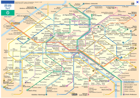 Photo: RATP
But this could all be a thing of the past, after a new design from Russian art director Constantine Konovalov, whose team spent two-and-a-half years redesigning the famous map.
His version is based on a circular pattern, seeing Line 2 and Line 6 made into a perfect circle and then a division of the maps into round segments.
See it below and check an interactive version here:
Photo: RATP
But this could all be a thing of the past, after a new design from Russian art director Constantine Konovalov, whose team spent two-and-a-half years redesigning the famous map.
His version is based on a circular pattern, seeing Line 2 and Line 6 made into a perfect circle and then a division of the maps into round segments.
See it below and check an interactive version here:
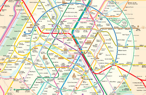 Photo: Constantine Konovalov
A closer look shows that the key tourist attractions have been added to the map.
Photo: Constantine Konovalov
A closer look shows that the key tourist attractions have been added to the map.
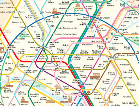 Photo: Constantine Konovalov
Konovalov told The Local that he started the redesign on his own initiative after a trip to Paris, adding that he hoped it could take off as a preferred option.
"I understand that people have gotten used to the old version but I hope that my map can be loved by Parisians," he said.
He compared the traditional map to a labyrinth with its series of complicated turns.
Photo: Constantine Konovalov
Konovalov told The Local that he started the redesign on his own initiative after a trip to Paris, adding that he hoped it could take off as a preferred option.
"I understand that people have gotten used to the old version but I hope that my map can be loved by Parisians," he said.
He compared the traditional map to a labyrinth with its series of complicated turns.
 Photo: Constantine Konovalov
The official site explains that the new version straightened the lines as much as possible, with two times fewer line bends than the official map.
Transport officials are yet to respond to him, he added.
The idea of a circular map for Paris has been attempted before.
In December, British academic Max Roberts redesigned the map to look like a wheel, with each line acting like a spoke, thereby "forcing the city into an unprecedented level of organization".
Photo: Constantine Konovalov
The official site explains that the new version straightened the lines as much as possible, with two times fewer line bends than the official map.
Transport officials are yet to respond to him, he added.
The idea of a circular map for Paris has been attempted before.
In December, British academic Max Roberts redesigned the map to look like a wheel, with each line acting like a spoke, thereby "forcing the city into an unprecedented level of organization".
 Photo: Max Roberts
"I hate the official RATP map, I think it is an incredibly poor piece of design," he told The Local at the time.
In 2014, architect Jug Cerovic also toyed with the idea of a more curved map.
Photo: Max Roberts
"I hate the official RATP map, I think it is an incredibly poor piece of design," he told The Local at the time.
In 2014, architect Jug Cerovic also toyed with the idea of a more curved map.
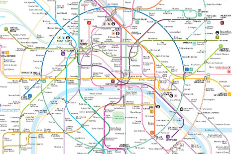 Photo: Jug Cerovic
Lastly, there was the Paris Metro map that went viral last year after listing the walking times in minutes between each station.
Transport planner Guillaume Martinetti told The Local in December last year that he hoped the map would get people out and about more.
Photo: Jug Cerovic
Lastly, there was the Paris Metro map that went viral last year after listing the walking times in minutes between each station.
Transport planner Guillaume Martinetti told The Local in December last year that he hoped the map would get people out and about more.
 Photo: Guillaume Martinetti
"I'd noticed that it was sometimes quicker to walk than to take the Metro for just one of two stops," he said. "So I decided to modify the map."
With Paris transport chiefs RATP yet to take on any of the changes, you can bet your last centime that we haven't seen the last confused tourist on the Paris Metro... yet.
Photo: Guillaume Martinetti
"I'd noticed that it was sometimes quicker to walk than to take the Metro for just one of two stops," he said. "So I decided to modify the map."
With Paris transport chiefs RATP yet to take on any of the changes, you can bet your last centime that we haven't seen the last confused tourist on the Paris Metro... yet.
Comments
See Also
If you've taken the Paris Metro before, you've probably seen tourists (and sometimes Parisians) staring blankly at the map before hopping on a train.
With over 300 stations and 16 lines (if you include 3bis and 7bis), it's no wonder that the map is a complicated one.
Here is a look at the traditional version below as a reminder.
Photo: RATP
But this could all be a thing of the past, after a new design from Russian art director Constantine Konovalov, whose team spent two-and-a-half years redesigning the famous map.
His version is based on a circular pattern, seeing Line 2 and Line 6 made into a perfect circle and then a division of the maps into round segments.
See it below and check an interactive version here:
Photo: Constantine Konovalov
A closer look shows that the key tourist attractions have been added to the map.
Photo: Constantine Konovalov
Konovalov told The Local that he started the redesign on his own initiative after a trip to Paris, adding that he hoped it could take off as a preferred option.
"I understand that people have gotten used to the old version but I hope that my map can be loved by Parisians," he said.
He compared the traditional map to a labyrinth with its series of complicated turns.
Photo: Constantine Konovalov
The official site explains that the new version straightened the lines as much as possible, with two times fewer line bends than the official map.
Transport officials are yet to respond to him, he added.
The idea of a circular map for Paris has been attempted before.
In December, British academic Max Roberts redesigned the map to look like a wheel, with each line acting like a spoke, thereby "forcing the city into an unprecedented level of organization".
Photo: Max Roberts
"I hate the official RATP map, I think it is an incredibly poor piece of design," he told The Local at the time.
In 2014, architect Jug Cerovic also toyed with the idea of a more curved map.
Photo: Jug Cerovic
Lastly, there was the Paris Metro map that went viral last year after listing the walking times in minutes between each station.
Transport planner Guillaume Martinetti told The Local in December last year that he hoped the map would get people out and about more.
Photo: Guillaume Martinetti
"I'd noticed that it was sometimes quicker to walk than to take the Metro for just one of two stops," he said. "So I decided to modify the map."
With Paris transport chiefs RATP yet to take on any of the changes, you can bet your last centime that we haven't seen the last confused tourist on the Paris Metro... yet.
Join the conversation in our comments section below. Share your own views and experience and if you have a question or suggestion for our journalists then email us at [email protected].
Please keep comments civil, constructive and on topic – and make sure to read our terms of use before getting involved.
Please log in here to leave a comment.